Even the best storyteller can use a little visual help to keep their audiences engaged. For presentations of all sizes, spending a little time on presentation design that will stand out and support your story – rather than distract from it – is crucial.
Here are some of our go-to design tips for creating an eye-catching presentation that will keep your audience hooked:
1. Less is more. More is best.
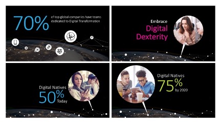
Don’t cram too much copy, or too many charts, or lots of visuals into a single slide. It’s better to break the content down into multiple slides that you can quickly refer to rather, than lingering on an eye chart.
2. Know thy Zoom
With most of us still doing our presentations online right now be sure to understand the tradeoffs of designing for virtual vs live presentations. A few key things to remember:
- Skip the complex slide transitions and animations. As a result of Internet lag times and varying location speeds you want to make sure to optimize your slides so they move swiftly when presenting remotely. Don’t leave your viewers lagging behind, instead use a simple transition like a fade or quick animation slide build.
- Design for small screen legibility. The smaller the screen the larger the font needs to be, make sure you have plenty of space between lines of text, and ensure you have good contrast between your copy and background so words are easy to read. If you are placing text over a graphic or background, consider using a transparent layer between the text and the image to increase contrast and legibility.
- Crop and compress. Don’t slow down your presentation uploads and viewing with large image files. Make sure to crop your images to just what you need and compress image size for onscreen viewing.
- Variety is key. We’ve all had the Zoom blur after staring at a screen for too long. Make sure your presentations have variety to their layout and design to keep your audience engaged.
3. Use infographic styles
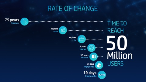
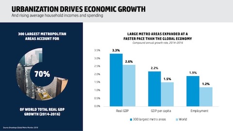
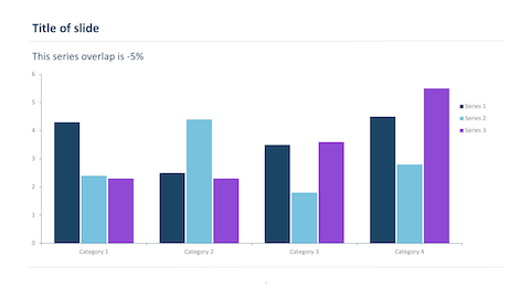
Bring data to life with an interesting visual representation. Use easy-to-grasp charts, illustrations, and graphics. Focus on the key point you are trying to make with the data and make that the focal point of your design.

4. White space is critical
Ensure you have enough white space on your slide to keep the audience focused on the key points. Not enough white space makes it hard to digest complex charts and text.
5. Use images that catch the eye
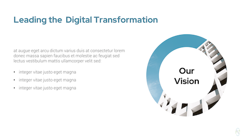
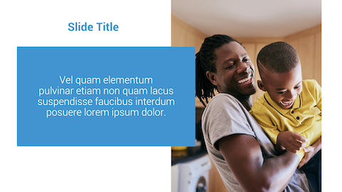
Whether you are using a photo as a metaphor, example, or to underscore a point, make sure the photography is compelling and relatable. Cool images are interesting and make people more engaged. They don’t have to be obvious to what you’re talking about as long as there is a suggestion of the idea there. Avoid overly posed people and cliches. Check out some of our favorite free stock photography websites.


6. Consider spicing up your presentation with videos or GIFs
For live presentations consider inserting videos, GIFs, motion graphics, or even audio soundbites to create more visual interest and make your talk feel more dynamic.

7. Create visual design consistency
Having variety in your presentation doesn’t mean throwing the kitchen sink at it. A presentation is a collection of individual slides, so those slides need to have visual cohesion. Keeping your fonts, colors, logo placement, etc., consistent through out are key. You can then alternate between a few different layouts to offer up some variety and keep your audience engaged. With that said, don’t go font crazy. Two different typefaces is more than enough and will keep your audience focused on the message.


8. Pay attention to visual heirarchy
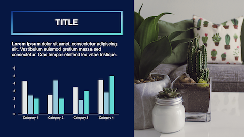
Font size, font weight, colors, etc., can help guide your audience as to how to read a slide. Slide titles or key takeaway statements should be the largest text on the slide. The same is true with images and charts where you can use size and color to emphasize the points you are trying to make. If your slide visual hierarchy is done correctly, the viewer doesn’t even have to think about where to look first as their eye is naturally drawn to each element, in the order they should review it.

9. Have fun
As humor can humanize a presenter and engage an audience, consider using a funny image or weaving in a light-hearted story. A little background on you as a presenter will also help the audience connect with you. If you are talking about always being an innovator or creator, why not add in a picture of your early lego experiments?


10. Summarize
Most people will only remember three or four things about your presentation. Choose what you want those things to be and reference them again at the conclusion in an easy to remember visual.
Take time thinking through your presentation design and maximize the opportunity you have with your audience. What are some of your favorite presentation design tips and hacks?


