At DoubleShot Creative, we recently shared our February creative crushes including marketing campaigns, social media posts, design trends, and more with each other to continue pushing the boundaries of creativity. When you witness someone else’s creative genius, it can often inspire you to tap into yours.
So, let’s lose ourselves in these creative marketing examples for a few minutes and look at some of our most recent creative crushes this month.
As self-proclaimed foodies, diving into the latest restaurant menu trends has been nothing short of a culinary adventure for us! We’re loving how restaurants are getting creative, not just with their mouth-watering dishes but with the menus themselves (and how the NY Times covers them!).
The vivid imagery that leaps off the page and the innovative typography weaving through the descriptions make every menu a feast for the eyes. It’s like each menu tells a story, inviting us into a world where flavor and design meet.
From the artistic presentation of dishes to the playful use of fonts, it’s clear that dining out is becoming a more immersive experience, and we’re here for every deliciously designed page!

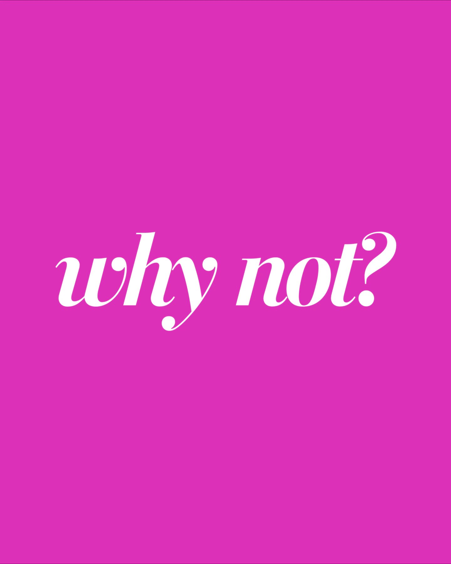
Diving into Daniel Pink’s inspiring “Why Not?” column has us buzzing with excitement and creativity, especially when we caught sight of the stunning graphic accompanying it.
It’s the kind of visual that captures the essence of stepping into the realm of endless possibilities, making it a perfect centerpiece for a blog post and engaging enough to repurpose across social media channels, spreading its motivational message far and wide.
The vibrant design and compelling question it poses, “Why Not?” invites viewers to challenge their own boundaries and embrace new opportunities. It’s not just a graphic; it’s a digital spark designed to ignite curiosity and action in all who see it!

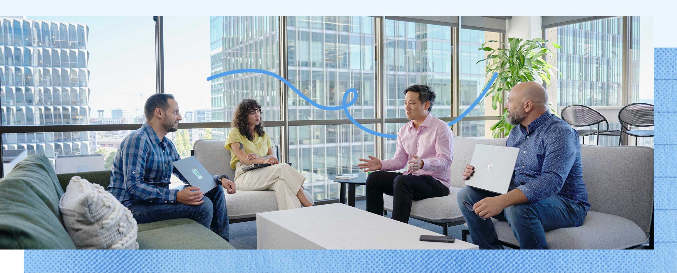
Exploring NerdWallet’s leadership page, we’re captivated by their fresh and dynamic branding approach! The genius use of paper tear effects behind photos adds an unexpected and delightfully tactile dimension to their digital presence, making their team pop off the screen. It’s this kind of creative flair that sets their branding apart, merging the digital and the tangible in a way that’s both innovative and engaging.
We’re taking notes and feeling inspired by how their strong branding tells a story of expertise and approachability, all while keeping things visually exciting.

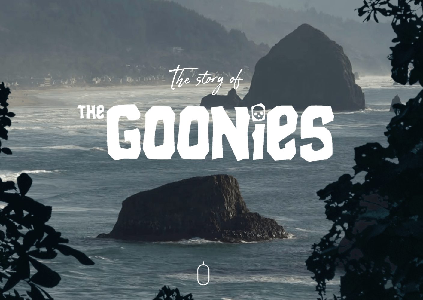
This “Goonies” website, is like stepping into a treasure map where every scroll reveals a new adventure in design and creativity! The incorporation of fun graphics and playful animations truly captures the spirit of the iconic film, making the digital exploration as exciting as the Goonies’ quest for One-Eyed Willy’s treasure.
From animated treasure chests to whimsical character illustrations, the site is a delightful homage that engages both die-hard fans and newcomers alike. It’s this seamless blend of nostalgia and modern design that sets their online presence apart, proving that when it comes to web design, The Goonies are still setting the bar for adventure.
We’re loving how each click and scroll brings a smile, reminding us that sometimes, the most memorable journeys are those that embrace fun at every turn.
Talk about making a splash with rebranding! Paywithfour’s new look is a vibrant explosion of perfectly paired colors that captures the essence of their fresh, new look. It’s a fun, engaging way to announce a rebranding, proving that change can be exciting and visually stunning. This is how you do it—rebranding with a burst of color and a whole lot of flair!
The Las Vegas Sphere is turning heads with its stunning design and revolutionary graphics. This architectural masterpiece is not just a building; it’s a colossal canvas that comes alive with dazzling digital art.
With graphics that envelop the sphere in a mesmerizing display of light and color, it’s a beacon of creativity that can be seen for miles. The Sphere is making headlines not just for its size and shape, but for how it transforms the city’s skyline into a dynamic, interactive showpiece. It’s a testament to how architecture and technology can come together using creativity to build something truly spectacular!
JaJa Tequila is absolutely crushing the marketing game, mixing humor, vibrant colors, and wickedly clever campaign ideas into a cocktail of social media brilliance.
Their graphics are not just fun; they’re like a party invitation you can’t ignore, bursting with personality and flair. It’s like each post on their feed isn’t just promoting tequila—it’s bringing the spirit of JaJa to life, one laugh, smile, and double-tap at a time.
With witty captions and eye-popping visuals that scream “Let’s have some fun,” they are making their brand as lively and enjoyable as their drinks. In a world where every scroll is a chance to stand out, JaJa Tequila is not just participating; they’re the life of the party.
Now we want to hear from you. What creative marketing examples have you been crushing on lately? Drop your favorites in the comments below.


